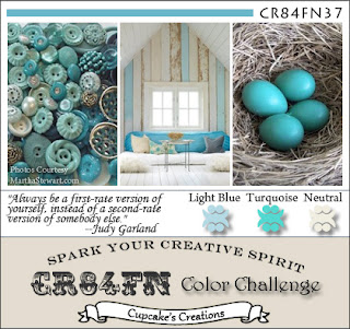
This card was created for the SCS Featured Stamper, Understandblue (Lydia) who is the SCS Community Manager and who has an awesome and eclectic gallery. I cased this card, using the colors of this week's CR84FN37 challenge. I felt this needed something else .. maybe it is too CAS? So I made this card:
Totally different look just by changing the card base! I think I like this one better than the first.
Thanks for coming by!
Supplies: Stamps - SU! Upsy Daisy; Paper - PaperTrey, Prism; Ink - Memento; Misc - Stamp-a-majig, Foam Squares


I like the second one better as well-pretty. Maybe if the first one was matted; still nice card. UD is one of my fav sets.
ReplyDeleteI agree - 2nd one is a bit better, but I think the first one just needs a sentiment and it will be perfect too!!!
ReplyDeleteMaria :)
And I like the first one best! See there is something for everyone :) I have that set and will CASE it for sure!
ReplyDeleteHarriet, BOTH are very pretty! I have always LOVED that image! THX for playing with us at CR84FN!
ReplyDeleteSo pretty! Thanks for joining along with CR84FN :)
ReplyDeleteGreat CAS cards. Both are pretty!
ReplyDeletePretty CAS cards Harriet!
ReplyDeleteI like both of them! I love CAS but find that CAC (clean and crisp) is more my style. Maybe it's yours too!
ReplyDeleteThese are both lovely, Harriet! Thanks for joining us at CR84FN!
ReplyDeleteSuch pretty cards Harriet! Love the silhouette effect! Thanks so much for playing along with CR84FN!!!
ReplyDeleteThis is simply lovely - I do like the shadow effect you've created. I think I've a marginal preference for the second card. But they are both gorgeous! Thanks for playing along with CR84FN!
ReplyDeleteTwo lovely card Harriet I love this stamp wish it was in our UK SU catalogue
ReplyDeleteAnne
Love the beautiful silhouette
ReplyDelete